
# Load packages
library(DESeq2)          # For differential expression analysis
library(EnhancedVolcano) # For creating volcano plots
library(tidyverse) # For misc. data manipulation and plottingRNA-Seq differential expression analysis
Week 4 lab
1 Introduction
1.1 Recap
Last week, you explored the RNA-Seq reads from Garrigós et al. (2025) and the Culex pipiens reference genome files.
In yesterday’s lecture, you learned about the steps to generate a gene count table from this input data:
- Read preprocessing: QC, trimming, and optionally rRNA removal
- Alignment of reads to a reference genome
- Quantification of expression levels by counting alignments
1.2 Today’s goals
I have performed the above steps for you already, and you will start with an R object that contains the output of step 3 above: a gene count table. Then, you will:
- Explore the data a bit
- Perform a Principal Component Analysis (PCA)
- Run a Differential Expression (DE) analysis
- Extract and visualize the DE results
2 Getting set up
2.1 Start an RStudio session at OSC
Start an RStudio session at OSC like we did last week and like you did for this week’s homework:
- Log in to OSC at https://ondemand.osc.edu
- Click on
Interactive Apps(top bar) and thenRStudio Server(all the way at the bottom) - Fill out the form as follows:
- Cluster:
Cardinal - R version:
4.4.0 - Project:
PAS2880 - Number of hours:
4 - Node type:
any - Number of cores:
2
- Cluster:
- Click the big blue
Launchbutton at the bottom - Now, you should be sent to a new page with a box at the top for your RStudio Server “job”, which should initially be “Queued” (waiting to start)
- Your job should start running very soon, with the top bar of the box turning green and saying “Running”
- Click
Connect to RStudio Serverat the bottom of the box, and an RStudio Server instance will open in a new browser tab. You’re ready to go!
2.2 Create an R script
Today, you’re going to write most of your code in an R script instead of typing it directly in the R console, as explained in the R homework:
Create and open a new R script by clicking
File(top menu bar) >New File>R Script.Save this new script right away by clicking
File>Save As. In the dialog box, you can save it right in the suggested folder (which is your OSC Home folder), or you can make a new folder for this course by clicking “New Folder” in the bottom left. Regardless, save the script aslab4_DE.R(the extension for R scripts is.R).
2.3 Load the R packages you will use
As part of your homework, you installed a few R packages that have functionality you’ll need in today’s lab.
Recall that R packages behave equivalently to other software/apps in the following way: while installation is a one-time thing, they need to be loaded in any given session to be used. So, let’s start with loading these packages:
Click to see expected output
library(tidyverse)── Attaching core tidyverse packages ──────────────────────── tidyverse 2.0.0 ──
✔ dplyr 1.1.4 ✔ readr 2.1.5
✔ forcats 1.0.1 ✔ stringr 1.5.2
✔ ggplot2 4.0.0 ✔ tibble 3.3.0
✔ lubridate 1.9.4 ✔ tidyr 1.3.1
✔ purrr 1.1.0
── Conflicts ────────────────────────────────────────── tidyverse_conflicts() ──
✖ dplyr::filter() masks stats::filter()
✖ dplyr::lag() masks stats::lag()
ℹ Use the conflicted package (<http://conflicted.r-lib.org/>) to force all conflicts to become errorslibrary(DESeq2)Loading required package: S4Vectors
Loading required package: stats4
Loading required package: BiocGenerics
Loading required package: generics
Attaching package: 'generics'
The following object is masked from 'package:lubridate':
as.difftime
The following object is masked from 'package:dplyr':
explain
The following objects are masked from 'package:base':
as.difftime, as.factor, as.ordered, intersect, is.element, setdiff,
setequal, union
Attaching package: 'BiocGenerics'
The following object is masked from 'package:dplyr':
combine
The following objects are masked from 'package:stats':
IQR, mad, sd, var, xtabs
The following objects are masked from 'package:base':
anyDuplicated, aperm, append, as.data.frame, basename, cbind,
colnames, dirname, do.call, duplicated, eval, evalq, Filter, Find,
get, grep, grepl, is.unsorted, lapply, Map, mapply, match, mget,
order, paste, pmax, pmax.int, pmin, pmin.int, Position, rank,
rbind, Reduce, rownames, sapply, saveRDS, table, tapply, unique,
unsplit, which.max, which.min
Attaching package: 'S4Vectors'
The following objects are masked from 'package:lubridate':
second, second<-
The following objects are masked from 'package:dplyr':
first, rename
The following object is masked from 'package:tidyr':
expand
The following object is masked from 'package:utils':
findMatches
The following objects are masked from 'package:base':
expand.grid, I, unname
Loading required package: IRanges
Attaching package: 'IRanges'
The following object is masked from 'package:lubridate':
%within%
The following objects are masked from 'package:dplyr':
collapse, desc, slice
The following object is masked from 'package:purrr':
reduce
Loading required package: GenomicRanges
Loading required package: GenomeInfoDb
Loading required package: SummarizedExperiment
Loading required package: MatrixGenerics
Loading required package: matrixStats
Attaching package: 'matrixStats'
The following object is masked from 'package:dplyr':
count
Attaching package: 'MatrixGenerics'
The following objects are masked from 'package:matrixStats':
colAlls, colAnyNAs, colAnys, colAvgsPerRowSet, colCollapse,
colCounts, colCummaxs, colCummins, colCumprods, colCumsums,
colDiffs, colIQRDiffs, colIQRs, colLogSumExps, colMadDiffs,
colMads, colMaxs, colMeans2, colMedians, colMins, colOrderStats,
colProds, colQuantiles, colRanges, colRanks, colSdDiffs, colSds,
colSums2, colTabulates, colVarDiffs, colVars, colWeightedMads,
colWeightedMeans, colWeightedMedians, colWeightedSds,
colWeightedVars, rowAlls, rowAnyNAs, rowAnys, rowAvgsPerColSet,
rowCollapse, rowCounts, rowCummaxs, rowCummins, rowCumprods,
rowCumsums, rowDiffs, rowIQRDiffs, rowIQRs, rowLogSumExps,
rowMadDiffs, rowMads, rowMaxs, rowMeans2, rowMedians, rowMins,
rowOrderStats, rowProds, rowQuantiles, rowRanges, rowRanks,
rowSdDiffs, rowSds, rowSums2, rowTabulates, rowVarDiffs, rowVars,
rowWeightedMads, rowWeightedMeans, rowWeightedMedians,
rowWeightedSds, rowWeightedVars
Loading required package: Biobase
Welcome to Bioconductor
Vignettes contain introductory material; view with
'browseVignettes()'. To cite Bioconductor, see
'citation("Biobase")', and for packages 'citation("pkgname")'.
Attaching package: 'Biobase'
The following object is masked from 'package:MatrixGenerics':
rowMedians
The following objects are masked from 'package:matrixStats':
anyMissing, rowMedianslibrary(EnhancedVolcano)Loading required package: ggrepelHere, and with all the code in this lab, type or copy it in your script, and send it to the console from there. Recall that you can send code to the console by pressing Ctrl + Enter (Windows) / Cmd + Return (Mac).
3 Loading and exploring the data
The main analyses you’ll perform today are a Principal Component Analysis (PCA) and a Differential Expression (DE) analysis. An R package that makes this relatively straightforward is DESeq2 (Love, Huber, and Anders (2014), package website), which you installed as part of your homework, and loaded just now.
DESeq2 has its own “object type” (a specific R format type), and the first step when working with this package is to create a DESeq2 object. I already did this for you, so you can focus on the analysis itself. The object consists of two main parts:
Sample metadata – accessed with
colData()
A table “mapping” samples to the groups they belong (here: treatment, time)Count table – accessed with
counts()
A table with one row per gene, one column per sample, containing the gene counts
Let’s load this DESeq2 object from a file. It’s stored in an R-specific format called an RDS file, which you can load with the readRDS() function:
# We give the object the name 'dds' (short for DESeqDataSet)
# (This is arbitrary and you could call it anything you want - but don't change it here.)
dds <- readRDS("/fs/scratch/PAS2880/ENT6703/results/dds.rds")
Let’s see what’s inside this DESeq2 object by simply typing its name:
ddsclass: DESeqDataSet
dim: 18855 22
metadata(1): version
assays(1): counts
rownames(18855): ATP6 ATP8 ... unassigned_gene_8 unassigned_gene_9
rowData names(0):
colnames(22): ERR10802863 ERR10802864 ... ERR10802885 ERR10802886
colData names(2): dpi treatmentThat printed a summary of the object, with the following key items:
class: The type of R object (here,DESeqDataSet)dim: The dimensions of the count table (genes x samples)rownames: The row names of the count table (here, gene IDs)colnames: The column names of the count table (here, sample IDs)colData names: The column names of the sample metadata table (colDatais used as a shorthand for “column data”, i.e. data associated with the columns of the count table, which are the samples)
3.1 The sample metadata
Last week, we looked at the TSV file with the sample metadata (metadata/meta.tsv), but we’ll take a closer look at this same sample metadata now.
It can be accessed with the colData() function, with the name of your DESeq2 object as the function’s argument:
colData(dds)DataFrame with 22 rows and 2 columns
dpi treatment
<factor> <factor>
ERR10802863 1 control
ERR10802864 1 cathemerium
ERR10802865 1 relictum
ERR10802866 1 control
ERR10802867 1 cathemerium
... ... ...
ERR10802882 10 cathemerium
ERR10802883 10 cathemerium
ERR10802884 10 control
ERR10802885 10 relictum
ERR10802886 10 relictum This output only shows the first 5 and last 5 rows with ... in between. To see the entire table more easily, you can first create a regular dataframe from it:
# This turns the colData() output into a regular data frame and stores it in 'meta':
meta <- data.frame(colData(dds))
And then take a look – e.g. with the View() function:
# View() will open the dataframe in a spreadsheet like view
# Below on this website, it's just printed in full
View(meta)
dpi treatment
ERR10802863 1 control
ERR10802864 1 cathemerium
ERR10802865 1 relictum
ERR10802866 1 control
ERR10802867 1 cathemerium
ERR10802868 1 relictum
ERR10802869 1 control
ERR10802870 1 cathemerium
ERR10802871 1 relictum
ERR10802874 1 relictum
ERR10802875 10 cathemerium
ERR10802876 10 relictum
ERR10802877 10 control
ERR10802878 10 control
ERR10802879 10 cathemerium
ERR10802880 10 relictum
ERR10802881 10 control
ERR10802882 10 cathemerium
ERR10802883 10 cathemerium
ERR10802884 10 control
ERR10802885 10 relictum
ERR10802886 10 relictumExercise: Interpret the metadata
Based on the information in the table, recap the study’s experimental design. How many timepoints and treatments are there? How many biological replicates per group?
3.2 The count table
The gene count table inside the DESeq2 object can be accessed with the counts() function:
# We'll wrap it in head() to only see the first 6 rows (genes):
head(counts(dds))
ERR10802863 ERR10802864 ERR10802865 ERR10802866 ERR10802867 ERR10802868
ATP6 10275 8255 4103 18615 11625 7967
ATP8 4 3 2 8 7 2
COX1 88041 83394 36975 136054 130863 62279
COX2 8749 7925 2901 16802 10026 6701
COX3 55772 50312 35074 80510 69850 42478
CYTB 38543 36352 22185 62147 57461 28159
ERR10802869 ERR10802870 ERR10802871 ERR10802874 ERR10802875 ERR10802876
ATP6 12788 4408 13648 13834 1346 10032
ATP8 2 0 2 1 3 2
COX1 109596 106402 104394 77682 38276 78290
COX2 11494 6603 11151 9893 1473 13146
COX3 68228 71945 66900 52368 14665 37275
CYTB 46219 52035 46090 35247 17449 38762
ERR10802877 ERR10802878 ERR10802879 ERR10802880 ERR10802881 ERR10802882
ATP6 987 1834 3337 5036 1983 11586
ATP8 0 0 0 3 0 27
COX1 17785 32099 64490 63960 50965 76113
COX2 1141 1907 3439 8334 2063 12752
COX3 8797 15948 26278 29997 17802 35419
CYTB 11177 22262 34368 33401 25854 43912
ERR10802883 ERR10802884 ERR10802885 ERR10802886
ATP6 18821 2792 11749 6682
ATP8 40 0 8 1
COX1 108343 65829 107741 94682
COX2 19148 2713 17947 10656
COX3 51441 24915 50029 47750
CYTB 57844 34616 50587 51198This output may look confusing at a glance. Only the first 6 rows (=genes) are printed, but because the table is quite wide, the output is “folded”. Pay attention to the row (gene) names to understand it better.
Exercise: Number of genes and samples in the count table
The nrow() and ncol() functions return the number of rows and columns, respectively, of data frames and similar rectangular data formats.
For example, if you had a data frame called my_df, then nrow(my_df) would return the number of rows in that data frame.
Use these functions on the count table to double-check the number of genes and the number of samples in the count table.
3.3 Library sizes
The total number of gene counts per sample is called the library size. This varies among samples for various reasons, but we don’t consider these differences to be biologically meaningful. For example, if sample A has 10 million reads and sample B has 20 million reads, we could not conclude that sample B had “more expression” or anything like that.
Does this make sense to you, or is it counter-intuitive?
How do the library sizes compare across samples? To see this, you can compute sums for each column (sample) using the colSums() function:
colSums(counts(dds))ERR10802863 ERR10802864 ERR10802865 ERR10802866 ERR10802867 ERR10802868
24297245 17177436 22745445 26849403 21471477 17506262
ERR10802869 ERR10802870 ERR10802871 ERR10802874 ERR10802875 ERR10802876
24299398 25490128 26534405 22194841 18927885 28804150
ERR10802877 ERR10802878 ERR10802879 ERR10802880 ERR10802881 ERR10802882
9498249 14807513 20667093 23107463 17545375 19088206
ERR10802883 ERR10802884 ERR10802885 ERR10802886
21418234 19420046 24367372 25452228 OK, lots of big numbers, so not that easy to read / interpret. Let’s manipulate that a bit:
- Convert the numbers to whole millions: divide by 1,000,000 and then round with
round() - Sorted the values (samples) from low to high with
sort()
sort(round(colSums(counts(dds)) / 1000000))ERR10802877 ERR10802878 ERR10802864 ERR10802868 ERR10802881 ERR10802875
9 15 17 18 18 19
ERR10802882 ERR10802884 ERR10802867 ERR10802879 ERR10802883 ERR10802874
19 19 21 21 21 22
ERR10802865 ERR10802880 ERR10802863 ERR10802869 ERR10802885 ERR10802870
23 23 24 24 24 25
ERR10802886 ERR10802866 ERR10802871 ERR10802876
25 27 27 29 Given what we just discussed: If one sample has 9 million reads and another 28 million reads, what implications does this have for comparing gene expression levels between them?
Bonus: How many genes have non-zero counts? (Click to expand)
Perhaps surprisingly, the gene count table often contains genes with zero counts across all samples: it simply contains all genes in the genome. In this dataset, how many genes have zero counts across all samples?
To compute this, first note that you can use rowSums() to compute total counts per gene. Then, you can make use of the following type of construct to count how many times that sum is greater than a certain number, here 0:
my_vec <- c(5, 0, 9)
my_vec > 0
[1] TRUE FALSE TRUEsum(my_vec > 0)[1] 2So, the number of genes with non-zero total counts can be computed like so:
sum(rowSums(counts(dds)) > 0)[1] 17788Your turn: How many genes have total counts of at least 10? (Click to see the solution)
sum(rowSums(counts(dds)) > 9)[1] 16682Your turn: How many genes have mean counts of at least 10? (Click to see the solution)
Now you need to divide the count sums by the number of samples (22):
sum(rowSums(counts(dds)) / 22 > 9)[1] 12676An even more robust way to do this is to not “hard-code” the number of samples (22), but to get it programmatically. This is the number of columns, which you can get with ncol()
sum(rowSums(counts(dds)) / ncol(counts(dds)) > 9)[1] 126764 Principal Component Analysis (PCA)
You will now run a PCA to look for overall patterns of (dis)similarity among samples. A PCA summarizes the variation in a high-dimensional dataset (here: gene expression levels across many genes) into a few “principal components” (PCs) that capture the most variation.
Doing this can help answer questions like:
- Do the samples cluster by treatment (infection status) and/or time point? If they do, that suggests that these variables have a strong effect on gene expression.
- Which of these two variables has a greater effect on overall patterns of gene expression?
- Is there an overall interaction between these two variables?
Before running the PCA, the count data should be normalized to account for differences in library size among samples and to “stabilize” the variance among genes1:
dds_vst <- varianceStabilizingTransformation(dds)The authors of the study did this as well:
We carried out a Variance Stabilizing Transformation (VST) of the counts to represent the samples on a PCA plot.
Next, you can run the PCA and plot the results with a single function call, plotPCA() from DESeq2:
# The 'intgroup' argument lets you pick the variables (columns) to color samples by
plotPCA(dds_vst, intgroup = c("dpi", "treatment"))
using ntop=500 top features by varianceWarning: `aes_string()` was deprecated in ggplot2 3.0.0.
ℹ Please use tidy evaluation idioms with `aes()`.
ℹ See also `vignette("ggplot2-in-packages")` for more information.
ℹ The deprecated feature was likely used in the DESeq2 package.
Please report the issue to the authors.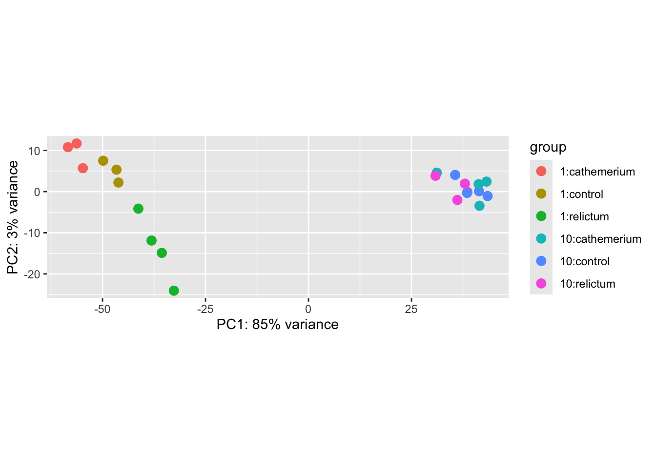
Exercise: Interpret the PCA result
Based on the above PCA plot, try to answer the three questions asked at the beginning of this PCA section.
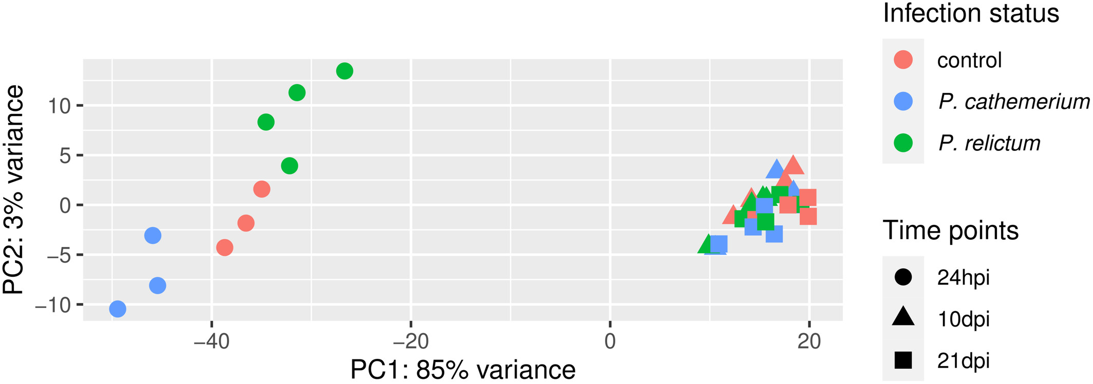
How does the the PCA plot in the paper (Figure 1) compare? Would you draw similar conclusions or do you see obvious differences?
Click to see the paper’s Figure 1
If you have time, you can pick one of the following bonus exercises to do:
Bonus exercise 1: Number of genes in the PCA
By default, the PCA run by plotPCA() does not summarize the variation in all genes, but only in the top 500 most variable genes. This tends to be a good representation of overall patterns, but it can be a good idea to check how robust the results are to this choice.
The plotPCA() function has an argument to change the number of included genes.
Figure out what the name of this argument is by check the help for the function (Hint: run
?plotPCAin the R console)Play around with different numbers of included genes (e.g., 100, all genes) and see how this affects the plot
Bonus exercise 2: Make a better PCA plot
Customize the PCA plot to make it better-looking and clearer.
For example, in the plot we made above, each combination of time point and treatment has a distinct color. But it would be better to use point color only to distinguish one of the variables, and point shape to distinguish the other variable, as was done in the paper’s Fig. 1.
To customize the plot, you’ll first need to get the data in a format you can use to build the plot from scratch. Do this using the returnData = TRUE argument of the plotPCA() function (check the partial solution below if needed).
Then, the plot customization will require some knowledge of ggplot2. If you don’t know how to do this yet, but still want to try, you can also try to use generative AI (Microsoft Copilot, ChatGPT, etc.) to help you write the code.
Partial solution: getting the dataframe
To be able to customize the plot properly, it’s best to build it from scratch ourselves, rather than using the plotPCA function. But then how do we get the input data in the right shape?
A nice trick is that we can use returnData = TRUE in the plotPCA function, to get plot-ready formatted data instead of an actual plot:
pca_df <- plotPCA(
  dds_vst,
  ntop = 500,
  intgroup = c("dpi", "treatment"),
  returnData = TRUE
  )
using ntop=500 top features by varianceClick to see a possible solution
This starts from the pca_df dataframe created in the first solution above:
ggplot(pca_df) +
  aes(x = PC1, y = PC2, color = treatment, shape = dpi) +
  geom_point(size = 5) +
  scale_color_brewer(palette = "Dark2", name = "Infection status") +
  theme_bw(base_size = 13)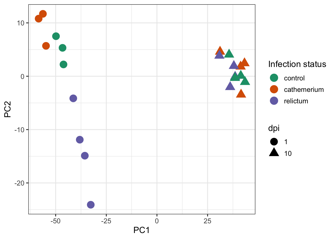
Finally, we may want to add the percentage of variance explained by each principal component (PC) to the axes labels. That can be done as follows:
# First extract and store the percentage of variance explained by different
# principal components, so you can later add this information to the plot:
pct_var <- round(100 * attr(pca_df, "percentVar"), 1)
pct_var
[1] 85.3 3.1# Remake the plot and customize the axes labels:
ggplot(pca_df) +
aes(x = PC1, y = PC2, color = treatment, shape = dpi) +
geom_point(size = 5) +
labs(
x = paste0("PC1 (", pct_var[1], "%)"),
y = paste0("PC2 (", pct_var[2], "%)")
) +
scale_color_brewer(palette = "Dark2", name = "Infection status") +
theme_bw(base_size = 13)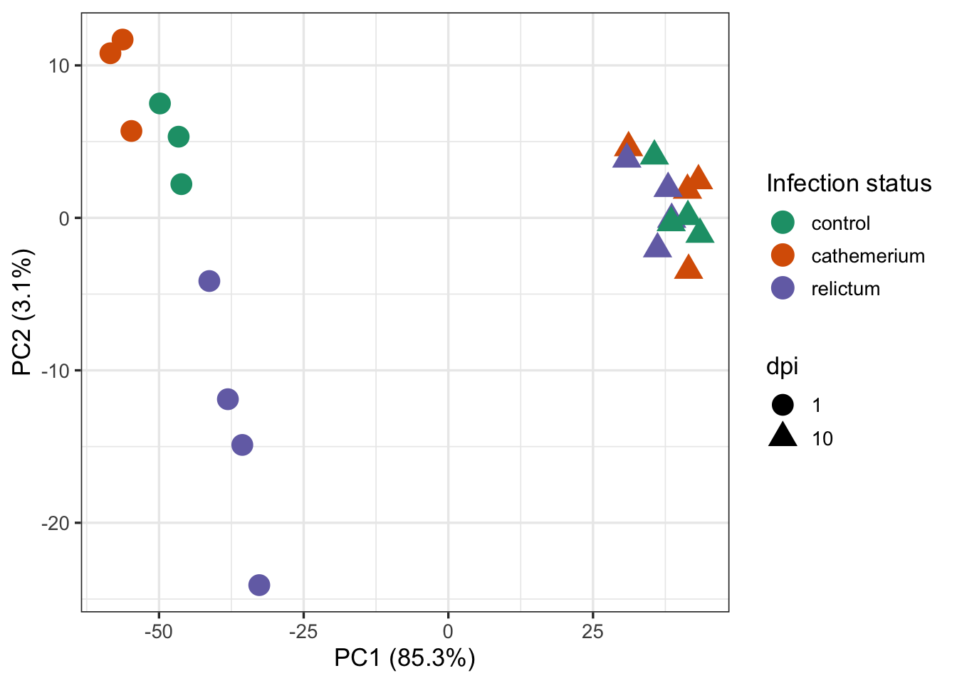
5 Differential Expression (DE) analysis
5.1 Figuring out how to do the analysis
First, let’s check how the paper’s authors did the DE analysis:
Then, we used the DESeq2 package (Love et al., 2014) to perform the differential gene expression analysis comparing: (i) P. relictum-infected mosquitoes vs. controls, (ii) P. cathemerium-infected mosquitoes vs. controls, and (iii) P. relictum-infected mosquitoes vs. P. cathemerium-infected mosquitoes.
This is not terribly detailed and could be interpreted in a couple of different ways. For example, they may have compared infection statuses by ignoring time points or by controlling for time points in various ways.
Ignoring time would mean analyzing the full dataset (all time points) while using the infection status as the only “independent variable”, i.e. using the design ~treatment.
Given the PCA results, do you think we can ignore the dpi variable? Why/why not?
Controlling for time can be done in two ways:
- An analysis with two independent variables:
~ dpi + treatment - Pairwise comparisons between each combination of
dpiandtreatment
If you take a look at Table 1 with the DE results, it should become clearer how they did their analysis:
How do you interpret this: did they run pairwise comparisons or a model with multiple variables?
Even pairwise comparisons with more than independent variable can be done in two ways, but we’ll use the most common one, which is to create a single, combined independent variable that is a combination of dpi and treatment.
5.2 Setting the statistical design
You will now create a new variable that is a combination of treatment and dpi, and call it group. First, create a vector with these combinations using the paste() function:
group <- paste(dds$treatment, dds$dpi, sep = "_")
group
[1] "control_1" "cathemerium_1" "relictum_1" "control_1"
[5] "cathemerium_1" "relictum_1" "control_1" "cathemerium_1"
[9] "relictum_1" "relictum_1" "cathemerium_10" "relictum_10"
[13] "control_10" "control_10" "cathemerium_10" "relictum_10"
[17] "control_10" "cathemerium_10" "cathemerium_10" "control_10"
[21] "relictum_10" "relictum_10" Next, turn this into a ‘factor’ and add it to the DESeq2 object (factors are a common R data type for categorical variables, and required by DESeq2):
dds$group <- factor(group)
dds$group
[1] control_1 cathemerium_1 relictum_1 control_1 cathemerium_1
[6] relictum_1 control_1 cathemerium_1 relictum_1 relictum_1
[11] cathemerium_10 relictum_10 control_10 control_10 cathemerium_10
[16] relictum_10 control_10 cathemerium_10 cathemerium_10 control_10
[21] relictum_10 relictum_10
6 Levels: cathemerium_1 cathemerium_10 control_1 control_10 ... relictum_10As a quick sanity check: which unique values does group have, and how many samples are in each? Use the table() function for this:
table(dds$group)
 cathemerium_1 cathemerium_10      control_1     control_10     relictum_1
             3              4              3              4              4
   relictum_10
             4
Lastly, set the analysis design by “adding” it to the DESeq2 object:
# Note: the symbol before 'group' is a tilde, ~
design(dds) <- ~ group
Phew, now you’re finally ready to run the DE analysis!
5.3 Running the DE analysis
While you had to do a lot of prep to get here, actually running the DE analysis is very simple. It’s done with the function DESeq(), which only needs to be provided with the DESeq2 object (because all the data and also the analysis options are specified in the object itself):
# (Note that the output is assigned back to the same `dds` object -
#  the DE results are added to it)
dds <- DESeq(dds)
estimating size factorsestimating dispersionsgene-wise dispersion estimatesmean-dispersion relationshipfinal dispersion estimatesfitting model and testingThe DESeq() function performs a bunch of steps consecutively, to:
- “Normalize” the count data by library size and composition
- Estimate of gene-wise variance in counts (“dispersion”)
- Fit the statistical model and calculate the test statistics
A key thing to understand is that above, DESeq2 automatically performed pairwise comparisons between each of the (6) levels of the group variable. This means that for any individual gene, it tested whether the gene is differentially expressed separately for each of these (15) pairwise comparisons.
Exercise: Pairwise comparisons
Would you say we are interested in all 15 pairwise comparisons?
If you’d like to see all possible pairwise comparisons, use the following R code:
combn(unique(group), m = 2)Click to show the output of the code above
     [,1]            [,2]         [,3]             [,4]          [,5]
[1,] "control_1"     "control_1"  "control_1"      "control_1"   "control_1"
[2,] "cathemerium_1" "relictum_1" "cathemerium_10" "relictum_10" "control_10"
     [,6]            [,7]             [,8]            [,9]
[1,] "cathemerium_1" "cathemerium_1"  "cathemerium_1" "cathemerium_1"
[2,] "relictum_1"    "cathemerium_10" "relictum_10"   "control_10"
     [,10]            [,11]         [,12]        [,13]
[1,] "relictum_1"     "relictum_1"  "relictum_1" "cathemerium_10"
[2,] "cathemerium_10" "relictum_10" "control_10" "relictum_10"
     [,14]            [,15]
[1,] "cathemerium_10" "relictum_10"
[2,] "control_10"     "control_10"
Each “column” in this ouput represents one pairwise comparison.
Summary of statistical considerations for the DE analysis
- Gene count normalization – to fairly compare samples, raw gene counts must be adjusted:
- By library size, the total number of gene counts per sample
- By library composition, e.g. to correct for extremely abundant genes that “steal” most of a sample’s counts
- Probability distribution of the count data
- Gene counts have a distribution similar to Poisson but with higher variance (the negative binomial distribution is typically used)
- Variance estimates are gene-specific but “borrow” information from other genes —
necessary in practice, but can make the analysis sensitive to false positives due to outliers (!)
- Multiple-testing correction
- 10,000+ genes are independently tested during a DE analysis, so multiple testing correction is needed!
- The most common approach is the Benjamini-Hochberg (BH) method (explanatory video)
6 Extracting the DE results
DESeq2 stores the results as a separate table for each pairwise comparison. Now, you’ll extract one of these tables.
6.1 The results table
You can extract the results for one pairwise comparison (which DESeq2 refers to as a contrast) at a time, by specifying it with the contrast argument as a vector of length 3:
- The independent variable of interest (here,
group) - The first (reference) level of the independent variable (in the example below,
relictum_1) - The second level of the independent variable (in the example below,
control_1)
res_rc1 <- results(dds, contrast = c("group", "relictum_1", "control_1"))

head(res_rc1)
log2 fold change (MLE): group relictum_1 vs control_1
Wald test p-value: group relictum_1 vs control_1
DataFrame with 6 rows and 6 columns
baseMean log2FoldChange lfcSE stat pvalue padj
<numeric> <numeric> <numeric> <numeric> <numeric> <numeric>
ATP6 7658.0445 -0.416305 0.609133 -0.683438 0.4943300 0.776172
ATP8 4.9196 -1.311116 1.388811 -0.944057 0.3451408 NA
COX1 75166.8670 -0.590935 0.282075 -2.094958 0.0361747 0.208045
COX2 7807.1848 -0.610152 0.578401 -1.054893 0.2914743 0.615249
COX3 41037.7359 -0.400173 0.251760 -1.589498 0.1119479 0.388880
CYTB 36916.6130 -0.501653 0.261927 -1.915242 0.0554617 0.266528What do the columns in this table contain?
baseMean: Mean expression level across all sampleslog2FoldChange: The “log2-fold change” of gene counts between the compared levelslfcSE: The uncertainty in terms of the standard error (SE) of the log2-fold change estimatestat: The value for the Wald test’s test statisticpvalue: The uncorrected p-value from the Wald testpadj: The multiple-testing corrected p-value (i.e., adjusted p-value)
Are any of the 6 genes shown above differentially expressed?
6.2 Log2-Fold Changes (LFCs)
In RNA-Seq analysis, log2-fold changes (LFCs) are the standard way of representing the magnitude (effect size) of expression level differences between two groups of interest. With A and B being the compared sample groups, the LFC is calculated as the log2 transformed ratio of the mean expression levels in each group:
\[ \log_{2} \left( \frac{\bar{A}}{\bar{B}} \right) \]
Due the log-transformation, the LFC also increase more slowly than a raw fold-change:
- An LFC of
1indicates a 2-fold difference - An LFC of
2indicates a 4-fold difference - An LFC of
3indicates a 8-fold difference
A nice property of LFC is that decreases and increases in expression are expressed symmetrically:
- An LFC of
1means that group A has a two-fold higher expression than group B - An LFC of
-1means that group A has a two-fold lower expression than group B
6.3 Numbers of differentially expressed genes (DEGs)
How many adjusted p-values were significant (less than 0.05)?
# (We need 'na.rm = TRUE' because some p-values are 'NA')
# (If we don't remove NAs from the calculation, sum() will just return NA)
sum(res_rc1$padj < 0.05, na.rm = TRUE)
[1] 801This means that you found 801 Differentially Expressed Genes (DEGs) for this specific pairwise comparison.
Exercise: DEG numbers
The paper’s Table 1 (which we saw above) reports the number of DEGs for a variety of comparisons. How does the number of DEGs we just got compare to what they found in the paper for this comparison?
Bonus exercise: Up- and downregulated DEGs
- The table also reports numbers of up- and downregulated genes separately. Can you get those numbers for your DE results?
Click to see the solution
- Option 1: Solution using tidyverse/dplyr:
# First convert the results table into a regular data frame:
as.data.frame(res_rc1) |>
  # Then, only select the rows/genes that are significant:
  filter(padj < 0.05) |>
  # If you run count() on a logical test, you get the nrs. that are FALSE v. TRUE
  dplyr::count(log2FoldChange > 0)
log2FoldChange > 0 n
1 FALSE 616
2 TRUE 185- Option 2: Solution using base R:
# Down-regulated (relictum < control):
sum(res_rc1$log2FoldChange < 0 & res_rc1$padj < 0.05, na.rm = TRUE)
[1] 616# Up-regulated (relictum > control):
sum(res_rc1$log2FoldChange > 0 & res_rc1$padj < 0.05, na.rm = TRUE)[1] 185- The table also reports the number of DEGs with an absolute LFC > 1. Can you get those numbers for your DE results?
Click to see the solution
- Option 1: Solution using tidyverse/dplyr:
# First we need to convert the results table into a regular data frame
as.data.frame(res_rc1) |>
  # Then we only select the rows/genes that are significant
  filter(padj < 0.05, abs(log2FoldChange) > 1) |>
  # If we run count() on a logical test, we get the nrs. that are FALSE v. TRUE
  dplyr::count(log2FoldChange > 0)
log2FoldChange > 0 n
1 FALSE 159
2 TRUE 49- Option 2: Solution using base R:
# Down-regulated (relictum < control):
sum(res_rc1$log2FoldChange < -1 & res_rc1$padj < 0.05, na.rm = TRUE)
[1] 159# Up-regulated (relictum > control):
sum(res_rc1$log2FoldChange > 1 & res_rc1$padj < 0.05, na.rm = TRUE)[1] 49Bonus exercise: Other pairwise comparisons
Extract the results for one or more other contrasts in the table, and compare the results.
7 DE result visualizations
Finally, you’ll create a few plots for the DE results you extracted above.
7.1 Volcano plot
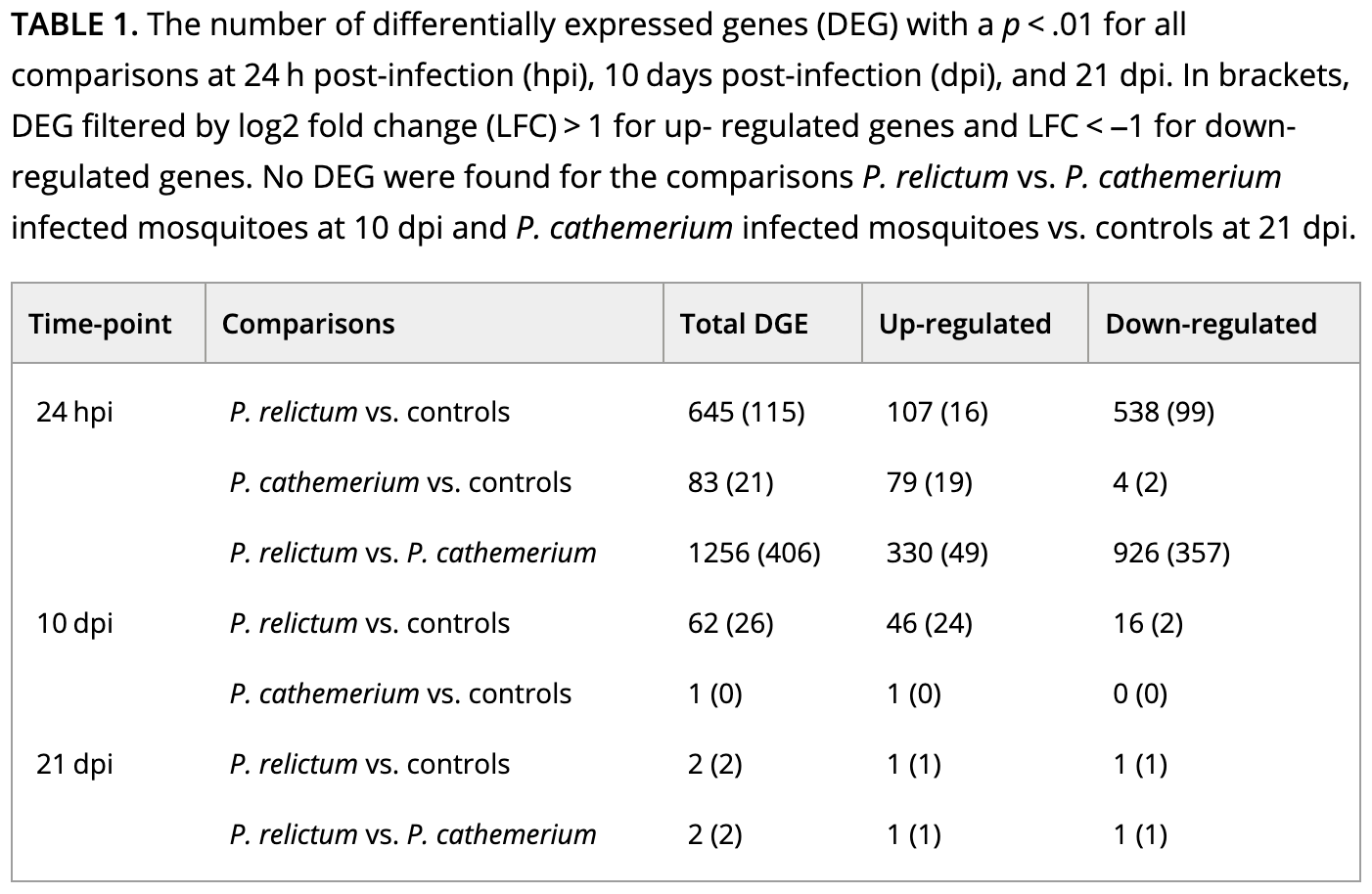
“Volcano plots” are a popular way to get a visual overview of DE results. You’ll do that here using the EnhancedVolcano() function from the package of the same name (see here for a “vignette” / tutorial):
EnhancedVolcano(
  toptable = res_rc1,       # DESeq2 results to plot
  x = "log2FoldChange",     # Plot the log2-fold change along the x-axis
  y = "padj",               # Plot the p-value along the y-axis
  title = "relictum vs. control at 24 hpi",  # Plot title
  lab = rownames(res_rc1),  # Use the rownames for the gene labels (though see below)
  labSize = 0               # Omit gene labels for now
  )
Warning: Using `size` aesthetic for lines was deprecated in ggplot2 3.4.0.
ℹ Please use `linewidth` instead.
ℹ The deprecated feature was likely used in the EnhancedVolcano package.
Please report the issue to the authors.Warning: The `size` argument of `element_line()` is deprecated as of ggplot2 3.4.0.
ℹ Please use the `linewidth` argument instead.
ℹ The deprecated feature was likely used in the EnhancedVolcano package.
Please report the issue to the authors.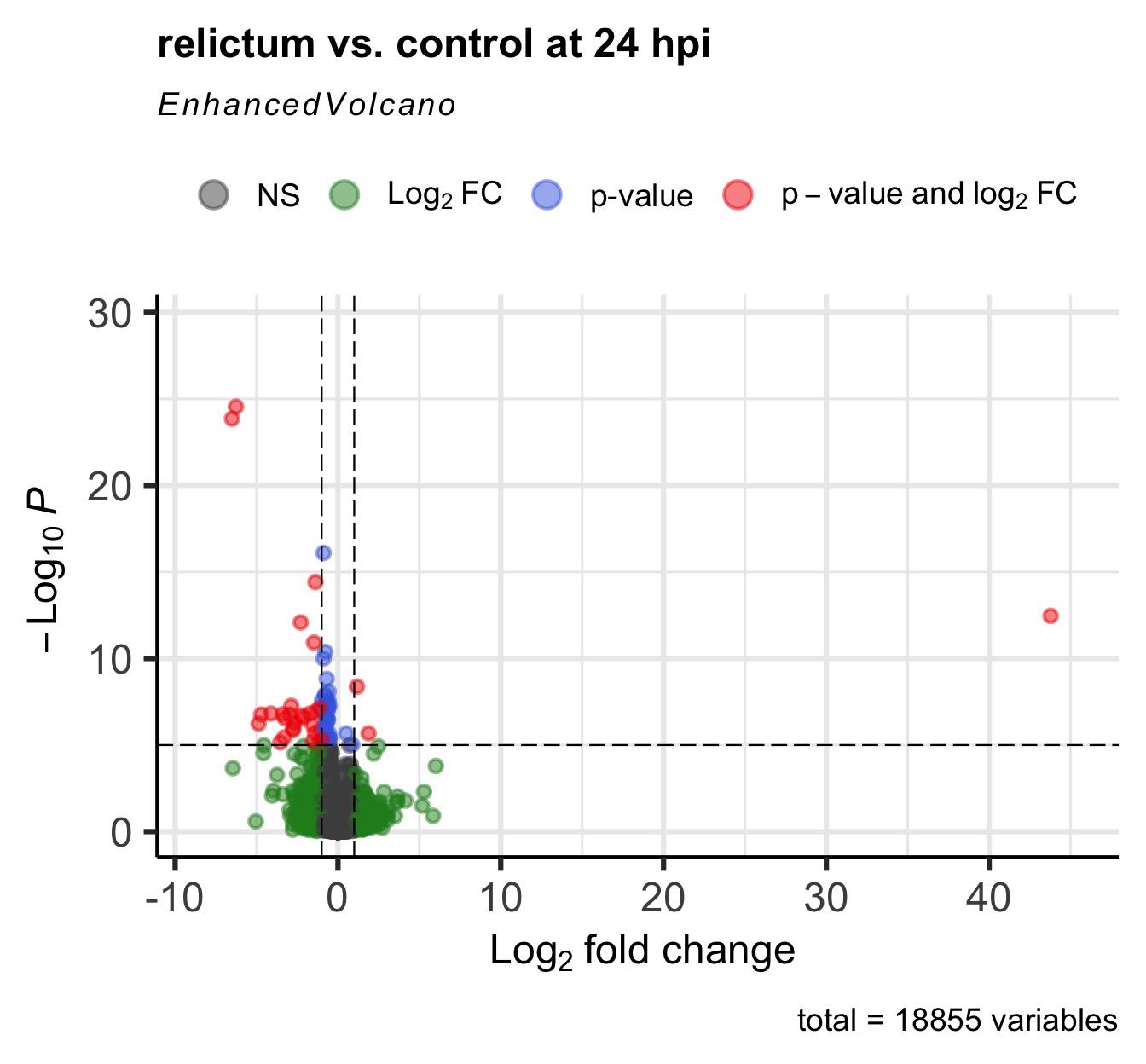
Exercise: Interpret the volcano plot
In the volcano plot, each gene is represented by a point. Many points are on top of each other, so it may not look like there’s thousand of them. This is not necessarily a problem, because we’re most interested in the overall patterns and the “sparser areas” away from the origin.
- What is shown along the y-axis? The higher a point is, the more…?
- What is shown along the x-axis? The further away from zero a point is, the more…? Why does the x-axis have both negative and positive values?
- What do the differently colored quadrants of the plot represent?
Based on the above:
- Is the pattern with respect to log2-fold change symmetric, and if not, what does this mean?
- Which points (genes) are the most interesting to follow up on, and why?
Bonus Exercise: Improve the Volcano Plot
The EnhancedVolcano() function by default adds gene IDs to highly significant genes, but above, we turned off gene name labeling by setting labSize = 0. I did this because the default p-value cut-off for point labeling is 1e-5 and in this case, that would make the plot quite busy with gene labels.
We might want to try a plot with a stricter p-value cut-off that does show the gene labels. Play around with the p-value cut-off and the labeling to create a plot you like.
Check the package’s explanatory “vignette” or the function’s help page (accessed by running ?EnhancedVolcano) to see how you can do this.
Click for an example
EnhancedVolcano(
  toptable = res_rc1,
  title = "relictum vs. control at 24 hpi",
  x = "log2FoldChange",
  y = "padj",
  lab = rownames(res_rc1),
  labSize = 4,               # Now we will show the gene labels
  pCutoff = 10e-10,          # Modify the p-value cut-off
  subtitle = NULL,           # I'll also remove the silly subtitle
  caption = NULL,            # ... and the caption
  )
Bonus Exercise: Which gene is the outlier?
One gene has a much higher log2-fold change than all the others.
Figure out the identity of this gene. You can do so either by labeling it in the plot, or by filtering the res_rc1 table.
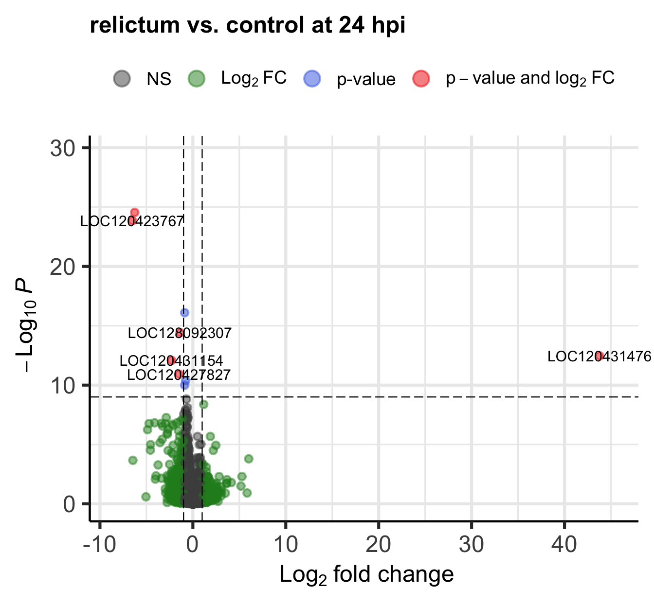
Click for the solution on how to label it in the plot
EnhancedVolcano(
  toptable = res_rc1,
  title = "relictum vs. control at 24 hpi",
  x = "log2FoldChange",
  y = "padj",
  lab = rownames(res_rc1),
  labSize = 4,
  pCutoff = 0.05,            # Modify the p-value cut-off
  FCcutoff = 20,             # Modify the LFC cut-off
  )
Warning: Removed 1 row containing missing values or values outside the scale range
(`geom_vline()`).
Click for the solution on how to find it in the results table
as.data.frame(res_rc1) |> filter(log2FoldChange > 20) baseMean log2FoldChange lfcSE stat pvalue
LOC120431476 39.72038 43.77762 5.301369 8.257795 1.483875e-16
padj
LOC120431476 3.434281e-13(Interestingly, there’s a second gene with a LFC > 20 that we hadn’t seen in the plot, because it has NA as the pvalue and padj. See the section “Extra info: NA values in the results table” in the Appendix above for why p-values can be set to NA.)
7.2 Plot specific genes
It can also be very informative to plot expression levels for individual genes, especially those with highly significant differential expression.
Let’s plot the single most highly significant DEG. We can get the ID of this gene as follows:
# Convert the results table into a regular dataframe and sort by adjusted p-value:
top_df <- data.frame(res_rc1) |> arrange(padj)

# Gene IDs are the row names: extract the first row name to get the gene of interest
top1 <- rownames(top_df)[1]
top1
[1] "LOC120423768"DESeq2 also has a built-in gene plotting function. This will by default plot normalized gene counts.
# Like with the PlotPCA function, 'intgroup' specifies which variable to use for grouping:
plotCounts(dds, gene = top1, intgroup = "group")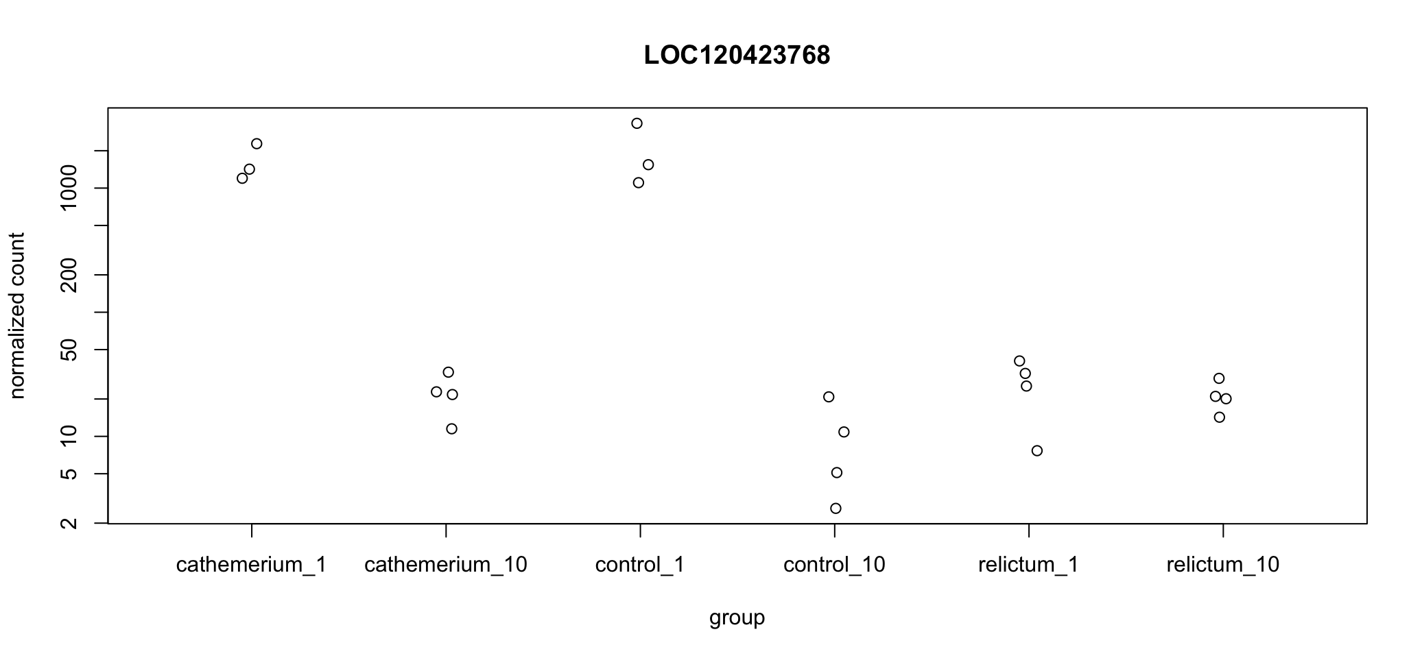
You may have to drag the right-hand pane in RStudio way to the left in order to see all the x-axis labels…
In the above plot, we’re not just seeing the difference between relictum_1 and control_1. Expression levels are plotted for all treatment-time combinations. That may not always be what you want, but it can be rather useful to see the expression patterns across all groups.
Exercise: Interpret the expression pattern
Does a visual “sniff test” support the statistical result that this gene is differentially expressed between
relictum_1andcontrol_1?What other patterns do you see in the expression levels across treatment and time points? Can you think of any biological interpretations for these patterns?
Exercise: Plot additional DE genes
Plot one or a few more of the top-DE genes. Do they have similar expression patterns across treatment and time points as the first one?
Click for a hint
You can get the gene IDs of, for example, the second most significant genes withrownames(top_df)[2]
Bonus exercise: Plot the outlier gene
Plot the gene with the very high LFC value that you saw when making the volcano plot. How would you interpret this result?
Click to get the ID of the outlier gene
A previous bonus exercise showed you how to find the ID of the outlier gene. It is:LOC120431476.
Click for the solution
plotCounts(dds, gene = "LOC120431476", intgroup = "group")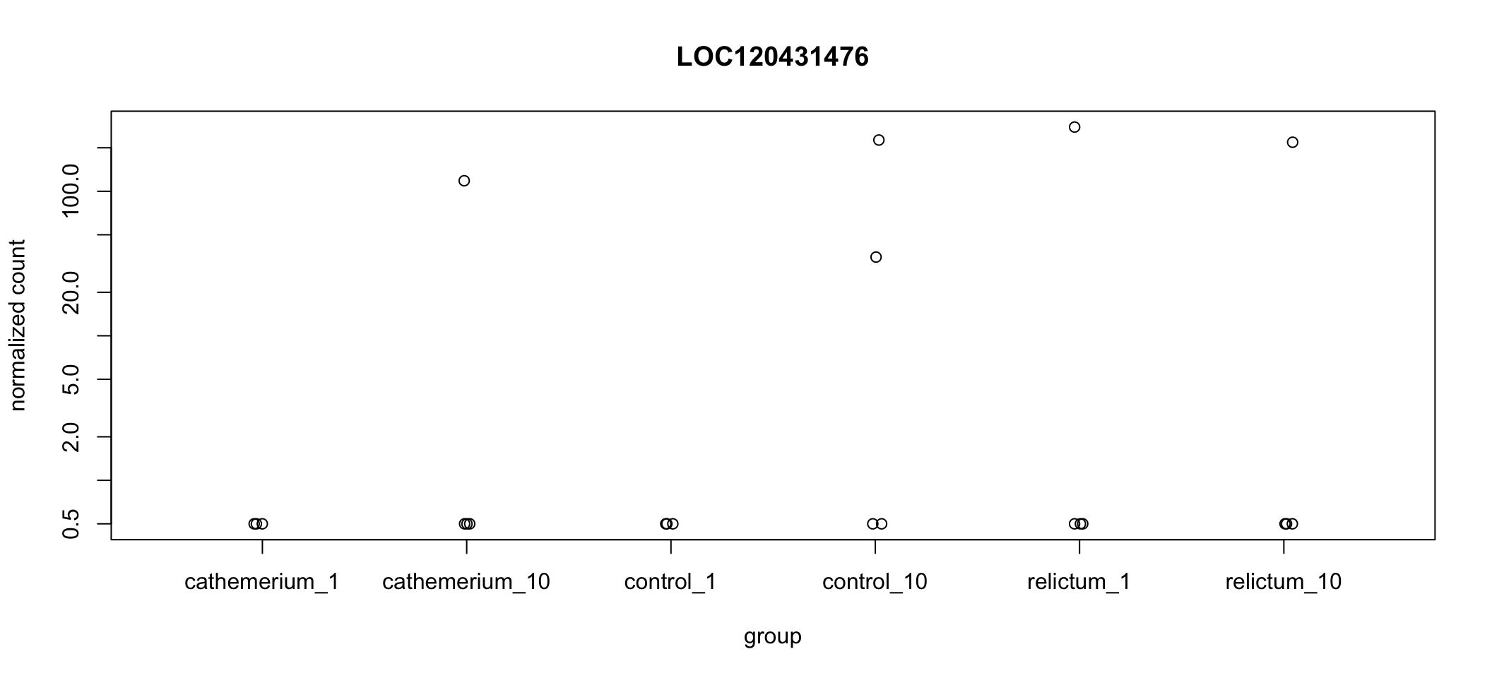
Wow! It looks like in every single dpi + treatment combination, all but one (or in one case, two) of the samples have zero expression, but there are several extreme outliers.
Our focal comparison is control_1 vs. relictum_1, and it looks like the difference between these two groups is solely due to the one outlier in relictum. Nevertheless, even the multiple-testing corrected p-value (padj) is significant for this gene:
as.data.frame(res_rc1) |>
  rownames_to_column("gene") |>
  filter(gene == "LOC120431476")
gene baseMean log2FoldChange lfcSE stat pvalue
1 LOC120431476 39.72038 43.77762 5.301369 8.257795 1.483875e-16
padj
1 3.434281e-13Bonus exercise: Make a better-looking plot
The default plotCounts() function creates a rather basic plot. Customize the plot with ggplot2 to make it better-looking and clearer.
Solution part 1: getting the dataframe
Below, you’ll use that DESeq2 function, but only to extract the counts for our gene of interest in a format for plotting, by adding returnData = TRUE:
# Use plotCounts with returnData = TRUE just to get a single-gene count table
# that is suitable for plotting:
focal_gene_counts <- plotCounts(
  dds,
  gene = top1,
  intgroup = c("dpi", "treatment"),
  returnData = TRUE
  )

# Take a look at the resulting dataframe:
head(focal_gene_counts)
count dpi treatment
ERR10802863 1543.81532 1 control
ERR10802864 2279.03704 1 cathemerium
ERR10802865 25.42295 1 relictum
ERR10802866 1105.75009 1 control
ERR10802867 1199.28425 1 cathemerium
ERR10802868 32.14394 1 relictumSolution part 2: Making the plot
focal_gene_counts |>
  # Treatment along the x-axis, gene counts along the y, color by treatment:
  ggplot(aes(x = treatment, y = count, fill = treatment)) +
  # Plot separate "facets" with the different time points
  facet_wrap(vars(dpi)) +
  # Add a boxplot with a partly transparent (alpha) color:
  # (Don't show outliers because we'll plot _all_ points next)
  geom_boxplot(alpha = 0.5, outlier.shape = NA) +
  # _And_ add individual points (with shape=21 for filled circles):
  geom_point(size = 4, shape = 21) +
  # Plot styling (e.g., we don't need a legend)
  theme_bw() +
  theme(legend.position = "none")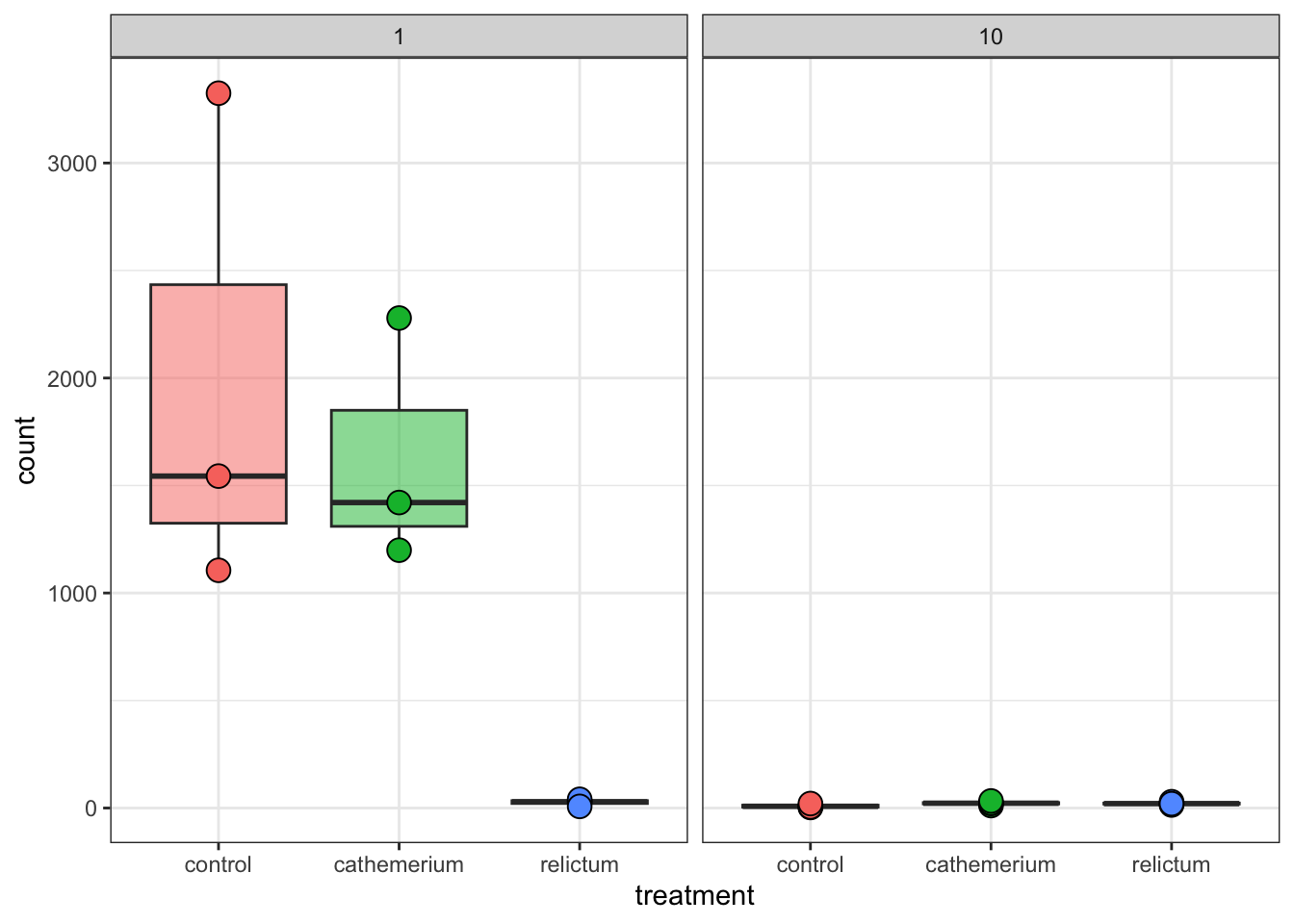
8 In Closing
Today, you have performed several steps in the analysis of gene counts that result from a typical RNA-Seq workflow. Specifically, you have:
- Explore the RNA-Seq gene expression data in a DESEq2 object
- Performed Principal Component Analysis
- Ran a Differential Expression (DE) analysis with DESeq2
- Extracted, interpreted, and visualized the DE results
What would be the next steps in such an analysis?
Typical next steps in such an analysis include:
- Additional summaries and plots can be made, such as heatmaps (see the Appendix below)
- Extracting, comparing, and synthesizing DE results across all pairwise comparisons (this would for example allow us to make the upset plot in Figure 2 of the paper)
- Functional enrichment analysis with Gene Ontology (GO) terms, as done in the paper, and/or with KEGG pathways.
9 Appendix
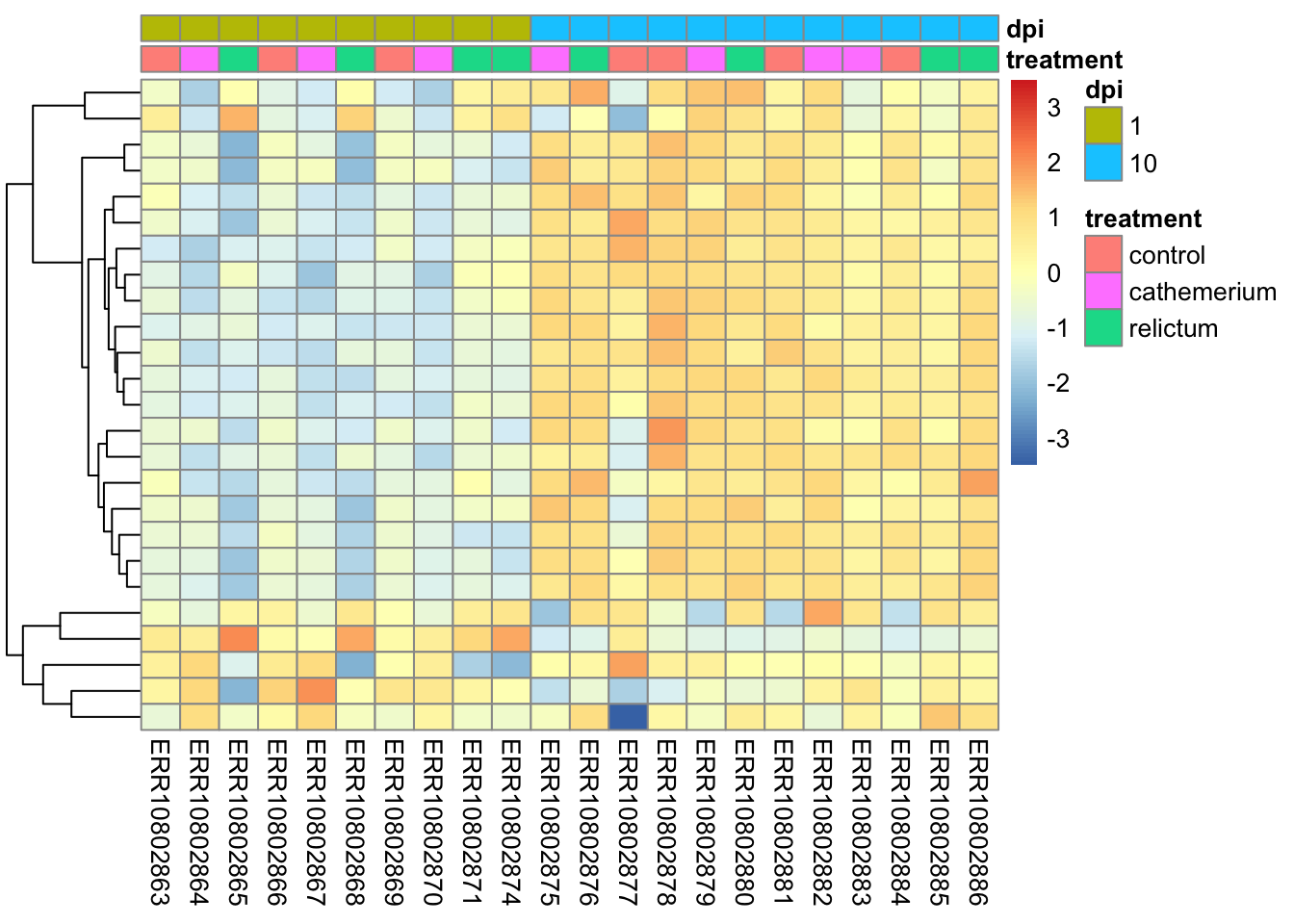
9.1 A heatmap
Rather than plotting expression levels for many individual genes, you can create “heatmap” plots to plot dozens (possibly even hundreds) of genes at once.
We will create heatmaps with the pheatmap function, and let’s make a heatmap for the top-25 most highly significant DEGs for the focal contrast. First, let’s install and then load this package:
# Install the pheatmap package [Output not shown]:
install.packages("pheatmap")
# Load the pheatmap package:
library(pheatmap)Unlike with some of the functions we used before, we unfortunately can’t directly use our DESeq2 object, but we have to extract and subset the count matrix, and also pass the metadata to the heatmap function:
# You need a normalized count matrix, like for the PCA
# You can extract the matrix from the normalized dds object we created for the PCA
# with the assay() function
norm_mat <- assay(dds_vst)

# In the normalized count matrix, select only the genes of interest
# We'll create a vector with the top256 most significant DEGs
top25_DE <- rownames(top_df)[1:25]
norm_mat_sel <- norm_mat[match(top25_DE, rownames(norm_mat)), ]
The plot will respect the order of samples in the count matrix, so let’s sort the metadata and then the count matrix sensibly:
# Sort the metadata
meta_sort <- meta |> arrange(treatment, dpi)

# Sort the columns in the normalized count matrix to match the metadata
norm_mat_sel <- norm_mat_sel[, rownames(meta_sort)]
Now you can create the plot:
pheatmap(
  norm_mat_sel,
  annotation_col = meta_sort,  # Add the metadata
  cluster_cols = FALSE,        # Don't cluster samples (=columns, cols)
  show_rownames = FALSE,       # Don't show gene names
  scale = "row",               # Perform z-scaling for each gene
  )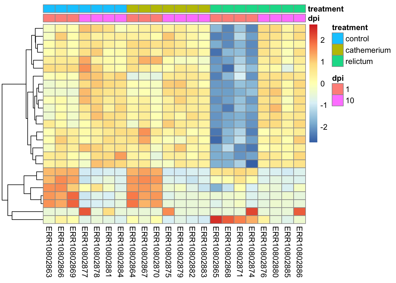
The z-scaling with
scale =will make sure we can compare genes with very different expression levels: after all, we’re interested in relative expression levels across samples/sample groupspheatmapwill by default perform hierarchical clustering both at the sample (col) and gene (row) level, such that more similar samples and genes will appear closer to each other. Above, we turned clustering off for samples to keep them in their groupwise order.
Bonus Exercise
Make a heatmap with the top-25 most-highly expressed genes (i.e., genes with the highest mean expression levels across all samples).
Click for a hint: how to get that top-25
top25_hi <- names(sort(rowMeans(norm_mat), decreasing = TRUE)[1:25])Click for the solution
# In the normalized count matrix, select only the genes of interest
norm_mat_sel <- norm_mat[match(top25_hi, rownames(norm_mat)), ]

# Sort the metadata
meta_sort <- meta |>
  arrange(treatment, dpi) |>
  select(treatment, dpi)

# Create the heatmap
pheatmap(
  norm_mat_sel,
  annotation_col = meta_sort,
  cluster_cols = FALSE,
  show_rownames = FALSE,
  scale = "row"
  )
9.2 Exporting the results
You may be wondering how you can save the DE results tables to files. You can do this with the function write_tsv(). This stores the table to a TSV text file, which can be opened in Excel.
# Write the results table to a TSV file:
write_tsv(as.data.frame(res_rc1), "DE-results_rc1.tsv")References
Garrigós, Marta, Guillem Ylla, Josué Martínez-de la Puente, Jordi Figuerola, and María José Ruiz-López. 2025. “Two Avian Plasmodium Species Trigger Different Transcriptional Responses on Their Vector Culex pipiens.” Molecular Ecology 34 (15): e17240. https://doi.org/10.1111/mec.17240.
Love, Michael I, Wolfgang Huber, and Simon Anders. 2014. “Moderated Estimation of Fold Change and Dispersion for RNA-Seq Data with DESeq2.” Genome Biology 15 (12): 550. https://doi.org/10.1186/s13059-014-0550-8.
Footnotes
Specifically, the point is to remove the correlation among genes between the mean expression level and the variance in expression.↩︎